Key Points
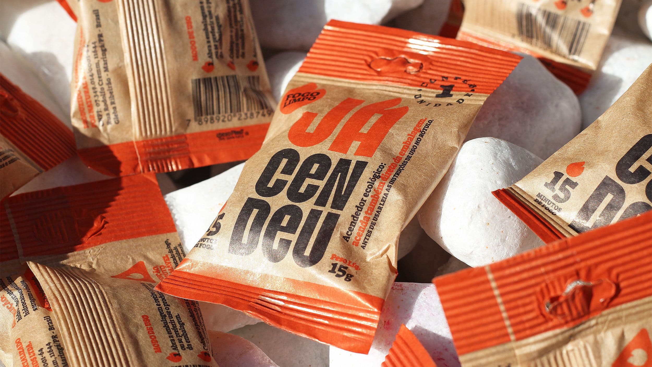
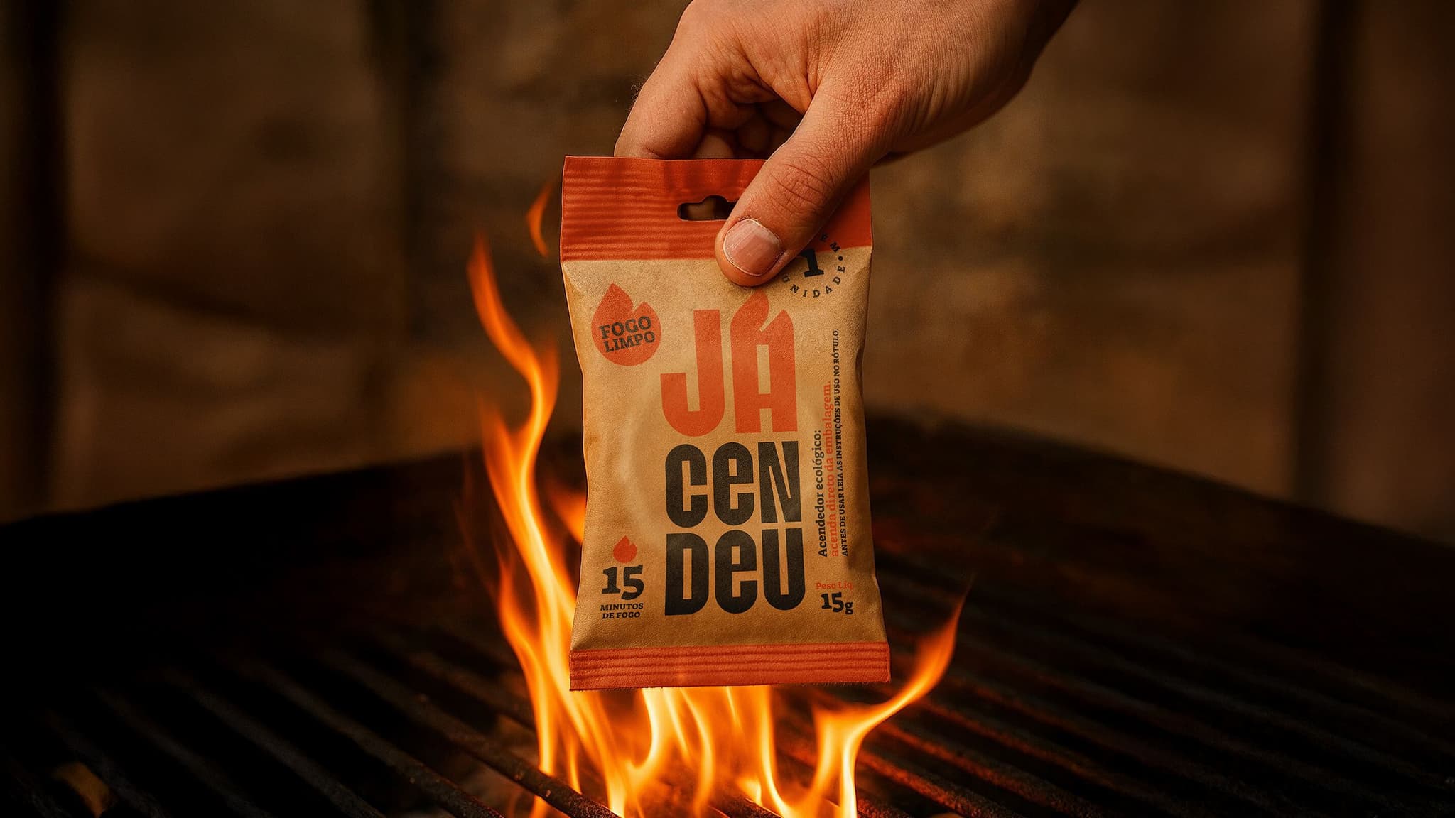
- Materials are part of the identity system: substrates, textures and finishes signal clarity and hierarchy (e.g., Jácendeu bamboo-waste lighter with burnable paper pack; ABRE-winning).
- Selection with printers first: coatings/laminations chosen to preserve colour depth and solids; hand-feel weighted as highly as visuals.
- Constraint playbook: rapid in-house prototyping, light/handling tests and direct supplier dialogue to prevent colour shift before press.
- Scaling reliably: internal database (tech sheets, colour curves, notes) plus Brand Books/production manuals for multi-region partners.
- What’s next: responsive substrates; premium biodegradable coatings; and digital–physical integration (variable print, invisible QR, traceability).
Full interview with Alexandre Nami - Founder and Creative Director Partner at Brandigno
1. How do your material choices reflect your visual identity ethos?
At Brandigno, we treat materials as an extension of identity, not just a physical support. The choice of substrates, textures, and finishes follows the same logic that guides the logo or color palette: to communicate clarity, hierarchy, presence, and even function.
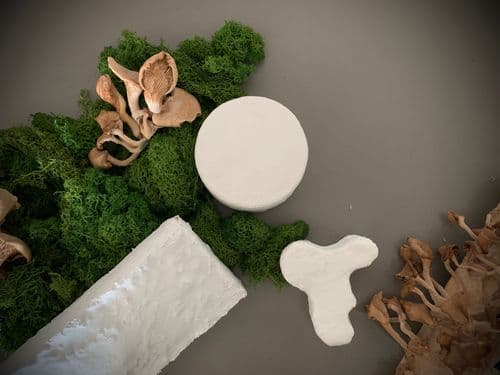
A strong example is Jácendeu, a charcoal lighter made entirely from bamboo waste, featuring paper packaging designed to be discarded directly into the fire. The project was recently awarded at the ABRE Awards, Brazil’s leading celebration of packaging excellence.
2. For projects like Keiko, how do you select and evaluate physical materials?
In the Keiko project, as in most of our work, we seek materials that converse with the brand’s core and connect seamlessly with its touchpoints.
We tested different coatings and laminations to preserve the intended color expression and ensure depth in solid areas. Selection happens side by side with the print partner, balancing perceived quality and production scalability. The final decision is guided by the sensory experience, what the person feels when holding the material is just as important as what they see.

3. What’s been your toughest material sourcing challenge, and how did you solve it?
One of the biggest challenges is finding materials that don’t distort color and accurately represent what’s seen on screen.
The solution usually comes through physical testing and direct dialogue with suppliers.
At Brandigno, we developed rapid testing protocols: we prototype internally, evaluate behavior under light and handling, and only then proceed to production. This reduces risk and keeps creative control within our process.

4. How do you ensure materials and finishes scale consistently across regions?
We maintain an internal database of tested materials, complete with technical sheets, color curves, and application notes.
For large-scale projects, we create Brand Books and technical production manuals that guide printers and suppliers on papers, finishes, and visual tolerances.

5. What material trends will shape brand design in the next decade, and how must sourcing platforms evolve?
Three material trends are set to define the next era of brand design. First, responsive materials, those that react to light, temperature, or touch, will enable adaptive sensory experiences, adding new dimensions to how people interact with packaging and branded objects. Second, the rise of premium biodegradable coatings will merge aesthetic appeal with circularity, offering an alternative to conventional plastics without compromising on performance. Third, digital–physical integration will become standard, as substrates evolve to support variable data printing, embedded QR codes, and end-to-end traceability. The future of material branding will be hybrid: ecological, measurable, and connected.